This is a list of some of the coding projects I’ve worked on, a mix of data science projects and code written for my PhD research.
shelfie
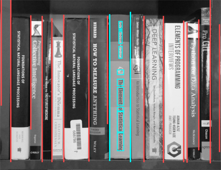
Shelfie is an interactive web app that automatically catalogues and prices books found in user-submitted images of bookshelves. The idea was to help people that want to quickly determine whether their used book collection is worth selling in a hassle-free manner.
You can try it out here: shelfie.site.
I built shelfie in early 2018 in a little over 3 weeks during my time as a fellow at Insight data science. The whole thing is built in Python (with just a bit of SQL), and the web app was made with the Flask framework. It uses machine learning, image processing techniques, and natural language processing for its algorithms.
Additional information can be found on the project repository on github.
nanoIV
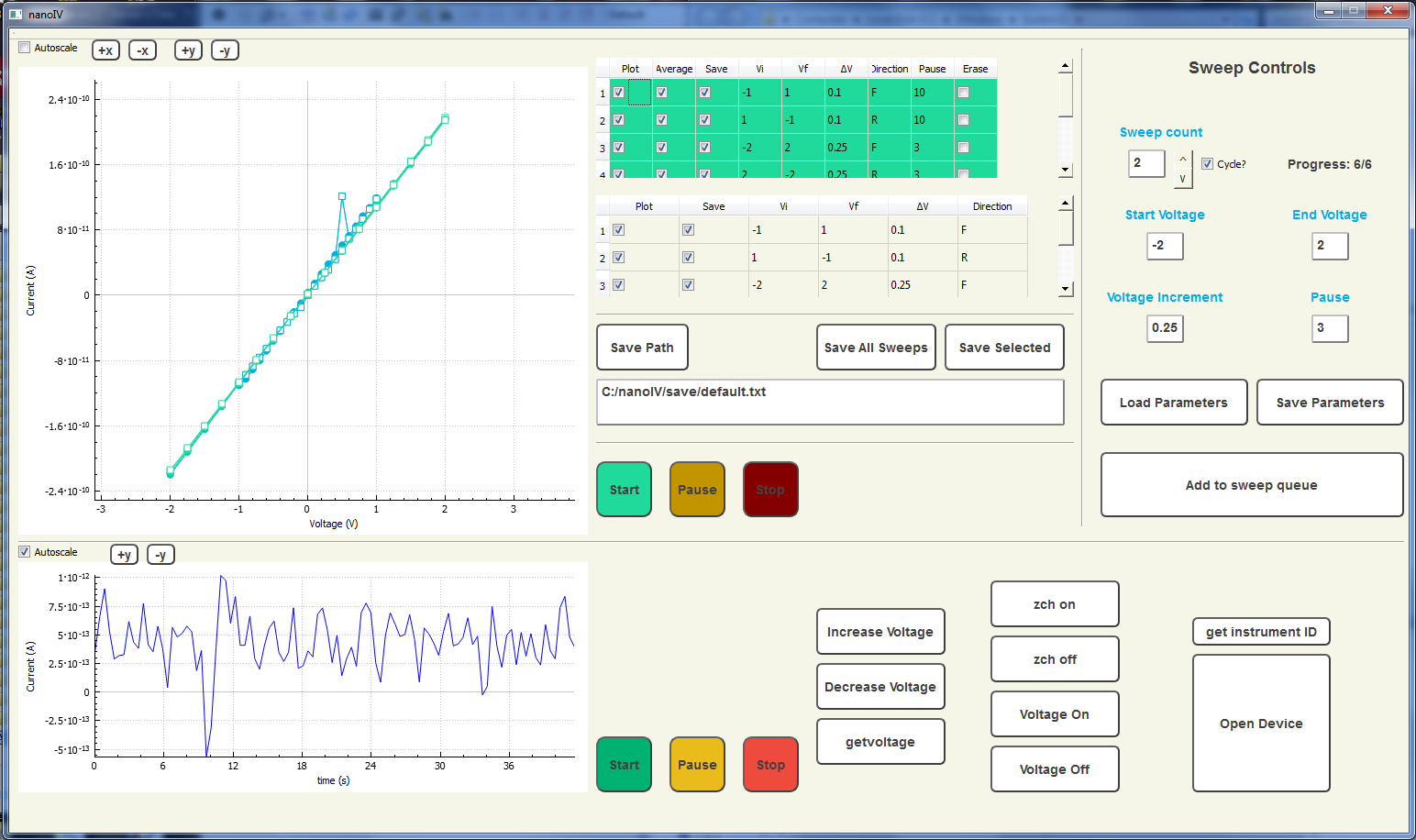
This is a GUI program written in C++ and Qt that enables remote control of a Keithley picoammeter. Two specific measurement protocols, IV curve and time-series measurement, are set-up and available simultaneously. The program displays the data in real-time and can be used to save the data. A separate script written in Python can be used to create a formatted Excel document from the acquired data. This was written to make my lab’s IV curve measurements more efficient and to provide real-time feedback on the noise characteristics of the systems we measure.
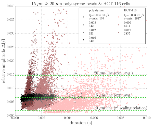
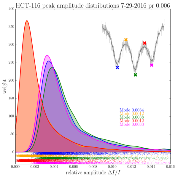
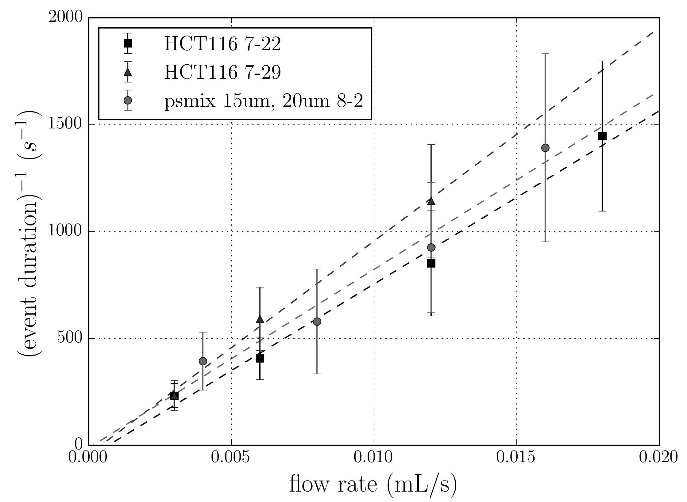
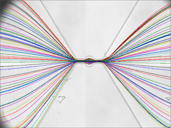
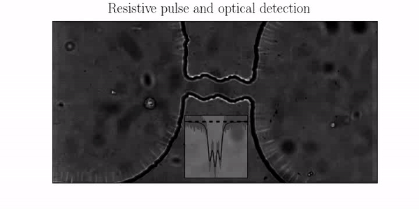
pore stats
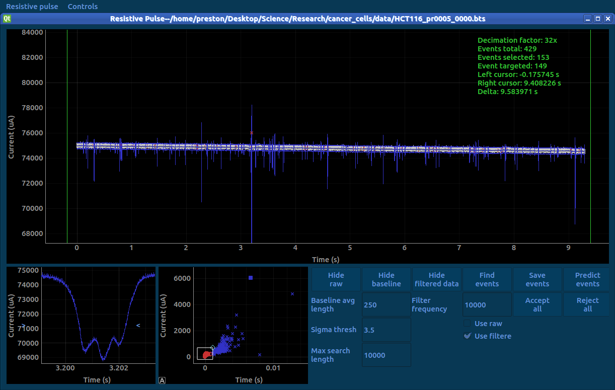
This was a collection of Python programs I wrote as part of a fellowship for creating an open-source data analysis package for resistive pulse experiments. The total package consists of a GUI program for detecting, validating, and saving resistive pulse events in time-series data, and a back-end library for analyzing the data. Because the experiment I’m running also implements a high-speed camera, the package includes some image analysis functions as well, including particle tracking, size measurement, and edge detection.
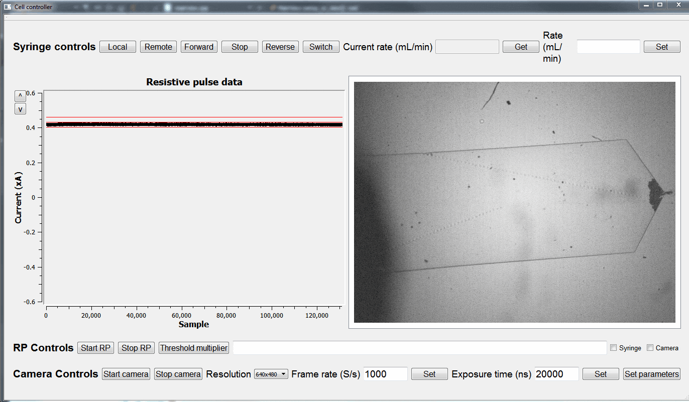
cell controller
I wrote this program to control a few measurement instruments I use for my cancer cell experiments. The program is written in C++ and Qt, and uses multi-threading to control a high-speed camera, data acquisition card, and a syringe pump.
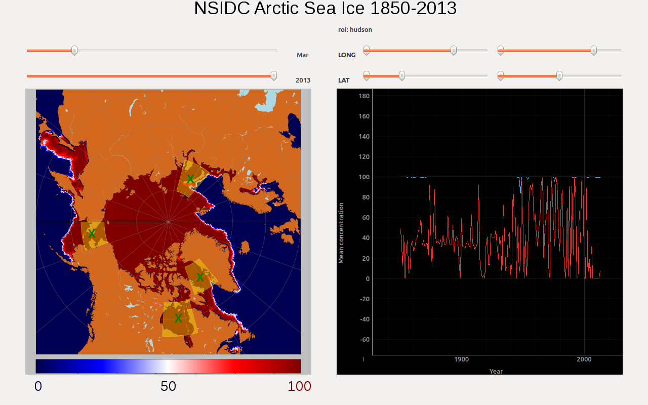
Arctic sea-ice visualization GUI tool
This program was developed in under 24 hours as my team’s entry for the 2017 UCI Data Science Initiative hackathon, and we were awarded as one of the winning groups! The application allows users to dynamically visualize sea ice concentrations in the Arctic from the 1800s to the present day. It is written in Python and PyQt. Here’s my group’s abstract:
The NSIDC Reconstruction of Arctic sea ice is a massive data set of sea ice concentration measurements taken from 1850 to 2014. The data set consists of monthly sea ice measurements taken at regularly spaced longitude-latitude coordinates centered on the North Pole, and is compiled from a wide variety of sources, from shipping reports to satellite microwave data. The data is useful because it allows researchers to study both the seasonal variation and long term trends in sea ice over the entire Arctic or in specific regions. However, due to the large size of the data set and the wide range of times and locations it covers, visualizing it can be difficult. In order to address this problem, we developed a graphical user interface (GUI) program written in Python and PyQt that enables dynamic and interactive visualization of the NSIDC data set. The program allows the user to quickly load and view a given month of measurements from the data set, and pan and zoom to focus on specific regions. Additionally, the user can select regions of interest to view a time-series of the average ice concentration local to that region at its annual high and low points. The program could be deployed as an educational outreach tool that allows users to discover for themselves how the Arctic’s sea ice is changing. The program could also be used by researchers to rapidly discover trends in Arctic sea ice that warrant a more in-depth study.
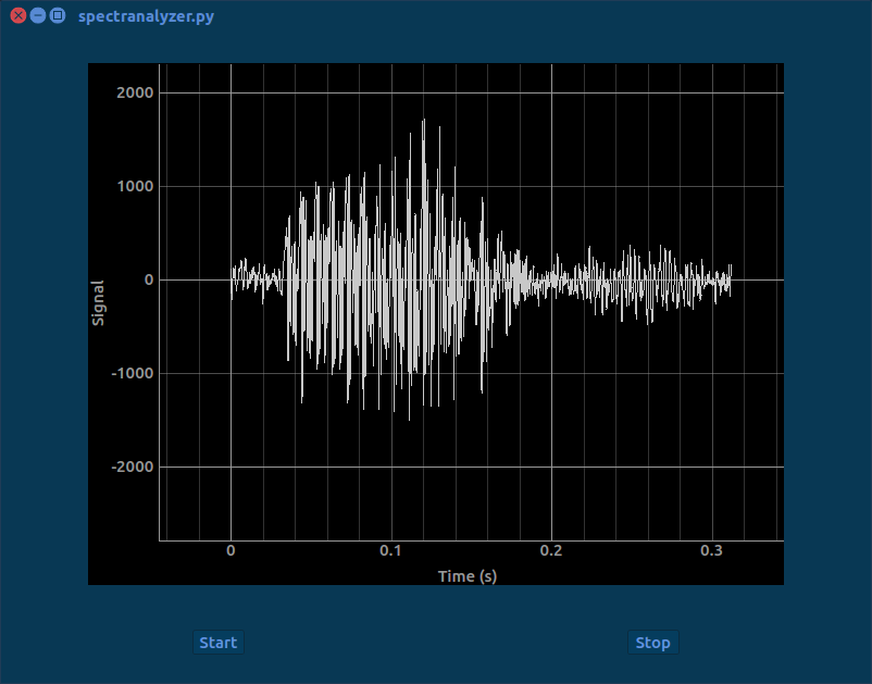
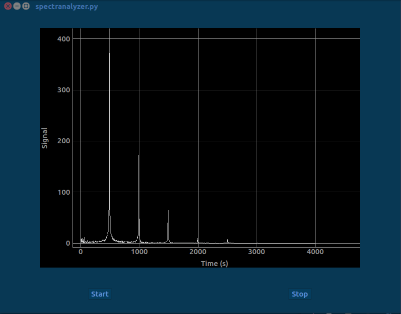
spectranalyzer
This is a Python + PyQt app takes in sound from a connected microphone and displays the waveform or the power spectrum (PSD) to the screen. Convenient if you’re interested in looking at the spectral composition of different sounds.