Quick matplotlib reference post
This is a quick post meant to serve as a reference for the various matplotlib functions that I use regularly, but inevitably forget the exact details for how to use (function arguments, etc.). I’ve included the code in Jupyter notebook format. The idea is that one should be able to copy-and-paste the code contained in this post to get their own plots up-and-running as quick as possible. I tried to include the most commonly used plot customizing functions, but if I’m missing something that you’d like to see added feel free to reach out through my e-mail address (tphinkle at gmail dot com) or in the comments section below.
Before getting in to it, I’ll explain my philosophy behind writing the code used to generate figures. Some of this is sound coding advice anyways.
-
The code used to generate the data and the code used to generate the representation of the data (i.e. the plot) should always be kept separate! This makes the code easier to read because you have a nice separation of the two orthogonal processes. The other, more concrete benefit is that if your data is computationally expensive to generate, you don’t have to do calculate it all again anytime you want to make a minor cosmetic change to the figure.
-
Your figures should be standardized. Whether you’re creating figures for a blog post or a paper, it’s aesthetically pleasing to have consistency between reocurring figure elements, e.g. colors, axis text size, etc. Create variables for cosmetic parameters you use so that you can easily keep them the same across different figures.
-
The code to generate your plot should also be standardized so that every action to modify the plot is called in the same relative order, every time. This makes it easier to find the exact line to modify if there is something you want to change, and also it allows you to have a nice template so that you can copy and paste all the code used to generate a figure and only have to modify it slightly.
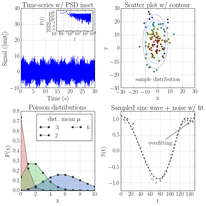
Anyways, here it is!
Generating the data
Imports
import numpy as np
import scipy.signal
from scipy.stats import poisson
import sklearn.linear_model
Data_0: Time-series + PSD
f_sample = 1000
T = 30

N = f_sample * T
t = np.linspace(0, T, N) # 30 seconds of data sampled at 1000 Hz

f = np.fft.fftfreq(N, 1./f_sample)[:N/2+1]

y_t = 1*scipy.signal.square(2*np.pi*.25*t, duty = .5) + .5*np.random.normal(0,5,N)
y_f = np.fft.rfft(y_t).real
S_f = y_f*y_f
x_0 = t
x_0_inset = f
y_0 = y_t
y_0_inset = S_f
Data_1: Scatter plot w/ contours
# Data points
mu_x = -2
mu_y = 5

sigma_x = 5.
sigma_y = 10.

A_x = 1./np.sqrt(2*sigma_x**2.*np.pi)
A_y = 1./np.sqrt(2*sigma_y**2.*np.pi)

x = np.random.normal(mu_x, sigma_x, 100)      # Normally distributed x-values
y = np.random.normal(mu_y, sigma_y, 100)     #    ""         ""     y-values

X = np.linspace(mu_x-10*sigma_x, mu_x+10*sigma_x, 1000)
Y = np.linspace(mu_y-10*sigma_y, mu_y+10*sigma_y, 1000)
Z = np.empty((X.shape[0], Y.shape[0]))
for i in range(X.shape[0]):
    for j in range(Y.shape[0]):
        Z[i,j] = A_x*A_y*np.exp(-((X[i]-mu_x)**2./(2*sigma_x**2.)+(Y[j]-mu_y)**2./(2*sigma_y**2.)))
x_1_0 = x
y_1_0 = y
x_1_1 = X
y_1_1 = Y
z_1_1 = Z
c_1 = c
Data_2: Poisson distributions with varying means
x = np.arange(0,500)

y_poisson = []
for i, mu_poisson in enumerate([.3, 2, 6, 10]):
    y_poisson.append(poisson.pmf(x, mu_poisson))
x_2 = x
y_2_0 = y_poisson[0]
y_2_1 = y_poisson[1]
y_2_2 = y_poisson[2]
y_2_3 = y_poisson[3]
Data_3: Sine-wave data w/ fit using regularized linear regression
N = 50
x_train = 150*np.random.rand(N).reshape(-1,1)
a = 3
b = 2
c = .2
y = np.array([np.sin(.05*x_train[i] + np.pi/3) for i in range(x_train.shape[0])])
y = y.reshape(-1,1)
error = np.array([np.random.normal(0, .05, 1) for i in range(x_train.shape[0])]).reshape(-1,1)
y_train = y + error


num_features = 20
X_train = np.empty((x_train.shape[0], num_features))
for i in range(X_train.shape[0]):
    for j in range(0, X_train.shape[1]):
        X_train[i,j] = x_train[i,0]**(j+1)

x = np.linspace(0,150,1000).reshape(-1,1)

mod_noreg = sklearn.linear_model.LinearRegression()
mod_noreg.fit(X_train, y_train)
y_pred_noreg = np.array([mod_noreg.intercept_[0] + sum(mod_noreg.coef_[i]*x[j,0]**(i+1)\
                                                            for i in range(mod_noreg.coef_.shape[0])) for j in range(x.shape[0])])

alpha = 1
mod_reg = sklearn.linear_model.Lasso(alpha = alpha)
mod_reg.fit(X_train, y_train)
y_pred_reg = np.array([mod_reg.intercept_[0] + sum(mod_reg.coef_[i]*x[j,0]**(i+1)\
                                                        for i in range(mod_reg.coef_.shape[0])) for j in range(x.shape[0])])
x_3_0 = x_train
y_3_0 = y_train
x_3_1 = x
y_3_1 = y_pred_reg
Create figure
Imports
import matplotlib.pyplot as plt
%matplotlib inline
import mpl_toolkits.axes_grid.inset_locator as mpl_tools
Cosmetic variables
# Text sizes
suptitle_size = 36
title_size = 24
axislabel_size = 22
axistick_size = 20
legendtitle_size = 22
legendlabel_size = 20
label_size = 20

# Colors
p_black = np.array([60, 60, 60])/255.
p_gray = np.array([120, 120, 120])/255.
p_red = np.array([214, 95, 95])/255.
p_green = np.array([106, 204, 101])/255.
p_blue = np.array([72, 120, 207])/255.
p_yellow = np.array([196, 173, 102])/255.
p_purple = np.array([180, 124, 199])/255.
Create the figures
# Create plot environment
fig, ax = plt.subplots(2, 2, figsize = (10,10))

# Plot 0 (top left)
fig.sca(ax[0,0])

plt.plot(x_0, y_0, zorder = 3)

plt.ylim(-10, 40)

plt.title('Time-series w/ PSD inset', size = title_size)
plt.xlabel('Time (s)', size = axislabel_size)
plt.ylabel('Signal ([unit])', size = axislabel_size)
plt.tick_params(labelsize = axistick_size)
plt.grid()

# Plot 0 (inset)
l_0, h_0, w_0, h_0 = 0, 0.4, 0.2, 0.2

ax_0_in = mpl_tools.inset_axes(ax[0,0], width = '50%', height = 1.0, loc = 1)
plt.sca(ax_0_in)

plt.loglog(x_0_inset, y_0_inset, zorder = 3)

plt.xlabel('f', size = axislabel_size*.8)
plt.ylabel('P(f)', size = axislabel_size*.8)
plt.tick_params(labelsize = axistick_size*.8)
plt.yticks([1e-9, 1e-6, 1e-3, 1e-0, 1e3, 1e6])
plt.grid()


# Plot 1 (top right)
fig.sca(ax[0,1])

plt.scatter(x_1, y_1, c = c_1, zorder = 3)
plt.contour(X_1, Y_1, Z_1, zorder = 3, alpha = .5)
plt.text(0, -25, 'sample distribution', size = label_size, rotation = 0, ha = 'center')

plt.xlim(-30, 30)
plt.ylim(-30, 30)

plt.title('Scatter plot w/ contour', size = title_size)
plt.xlabel('x', size = axislabel_size)
plt.ylabel('y', size = axislabel_size)
plt.tick_params(labelsize = axistick_size)
plt.grid()

# Plot 2 (bottom left)
fig.sca(ax[1,0])


plt.plot(x_2, y_2_0, color = p_black, marker = 's', zorder = 3, label = r'.3')
plt.fill_between(x_2, y_2_0, color = p_red, alpha = .4, zorder = 3)

plt.plot(x_2, y_2_1, color = p_black, marker = 's', zorder = 3, label = r'2')
plt.fill_between(x_2, y_2_1, color = p_green, alpha = .4, zorder = 3)

plt.plot(x_2, y_2_2, color = p_black, marker = 's', zorder = 3, label = r'6')
plt.fill_between(x_2, y_2_2, color = p_blue, alpha = .4, zorder = 3)


plt.xlim(0,10)

plt.title('Poisson distributions', size = title_size)
plt.xlabel('x', size = axislabel_size)
plt.ylabel('P(x)', size = axislabel_size)
plt.tick_params(labelsize = axistick_size)


leg = plt.legend(title = 'dist. mean $\mu$', loc = 'upper right', fontsize = legendlabel_size, ncol = 2)
leg.get_title().set_fontsize(legendtitle_size)
plt.grid()


# Plot 3 (bottom right)
fig.sca(ax[1,1])

plt.scatter(x_3_0, y_3_0, marker = 'x', zorder = 3, color = p_gray)
plt.plot(x_3_1, y_3_1, lw = 3, ls = '--', color = p_black)
plt.annotate('overfitting', xy = (140, .9), xycoords = 'data', xytext = (80, .25),\
             textcoords = 'data', ha = 'center', va = 'center', fontsize = label_size,\
             arrowprops = dict(arrowstyle = '->', connectionstyle = 'arc3'))

plt.xlim(np.min(x_3_1), np.max(x_3_1))
plt.ylim(-1.25, 1.25)

plt.title('Sampled sine wave + noise w/ fit', size = title_size)
plt.xlabel('t', size = axislabel_size)
plt.ylabel('S(t)', size = axislabel_size)
plt.tick_params(labelsize = axistick_size)
plt.grid()


fig.tight_layout()

plt.savefig('./file_name.png', dpi = 300)
plt.show()